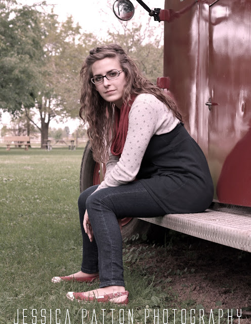
I don't really put a stamp/logo (whatever you'd like to call it) on my photos. Mainly because...
#1- I'm not completely 100% set on a business name
#2- I don't know exactly what I want it to look like
#3 - There are so many that I see that I do not like and I don't want people to look at mine like that.
I understand the importance of them but I really don't like when the logo takes over the photo and is just obnoxious. It completely takes away from the photo.
Therefore, I know I want mine to be really simple, non distracting while still getting the point across that it's my photo. And includes my current obsession of all white capital letters.
I would love to call my photography business JP Photography naturally but sadly there is already a really well known photographer in the area with that name. This makes me really sad because I really wanted my frame and photography businesses to be cohesive. I don't think it makes sense to put JP Designs on my photos though. So until I move somewhere cool I can't use JP Photography and by then I won't want to change my business name. I can't think of anything creative and like the simplicity of just using your name. So that's what I've got so far.
Suggestions welcomed. :)
Also I've still been practicing my editing skills. It's a process. My friend Jordan in the photos below and I are scheduled to have Editing 101 because she's pretty good at it. I guess Lightroom is the way to go. Do any of you use Lightroom?
That's all the ramblings I have on logos and editing for now. Just had to get that out.
Have two sessions this weekend and I can't wait!


4 comments:
my 2cents is that you'd want your logo somewhere in the middle of your pics so that people can't crop it out and then print the pics themselves without ordering through you :) That's why I've always thought they were smack dab in the middle of pics ??
Thanks for your two cents. I love it :) I will definetely do that for photos I take for clients that I'm worried people will steal instead of buy. But I guess for these I didn't feel it necessary and liked it on the bottom of some . :) glad you still read my blog!
I get the sense that you "know" you "should" be watermarking aka putting your sig on your pictures ;-) I only logo the ones I don't want people to "borrow" or steal without knowing where it came from. I completely felt the same way you did about not wanting the signature to overtake the beauty in the photo, but unfortunately we live in a world where people "borrow" or take things from sites and don't always give credit back.
I'm sure you've seen on a lot of my pics I change my font around all the time on them--I like you change my mind on logo ideas and such. :)
That's so true! Not that many people check my blog at this point so when I have my business blog I will definitely take more care into watermarking every photo. And your logos are always cute! I wish I knew how to make stuff like that!
Post a Comment